Copper Sky's Top 10 Atlanta Kitchen Renovations
If you're dreaming of giving your kitchen a much-needed refresh, use these stunning Copper Sky kitchens—our top 10 favorites—as inspiration.
10. American Foursquare - Kitchen Remodel in Inman Park
The number ten kitchen on our list is this beautiful Inman Park kitchen renovation in the historic Inman Park neighborhood in Atlanta. This kitchen renovation was part of a full home renovation that earned us the 2019 Silver OBIE Award Winner for Best Whole Home Remodel.
The clients really wanted to make sure that they stayed true to the historic design of the house and the original appearance, not only just out of love for the historic nature and the neighborhood, but also in part due to the historic regulations that they had to adhere to.
The house actually began as a small four square, and on the front elevation, all of the windows had to stay intact. The house originally had a kitchen that was placed in the front of the house, and it entailed a very large expansive staircase that we kept, but also included those windows that you see to the right. There wasn't a lot of wall space in order to enlarge the kitchen. They're a growing family, young children, young couple, so we wanted to make sure that we maximized the square footage of this house.
They had a huge lot that allowed for us to be able to extend it, and when you look at the kitchen, you'll see where the extension actually starts; in the breakfast nook. Where the kitchen sits now was actually a bedroom, and that's where the house stopped. We wanted to make sure that in keeping with the tradition of the house, all of the flooring is heart pine flooring. We kept that natural just to bring out the natural beauty of the home and to showcase what had been here since 1906 when the house was built.
The breakfast nook was a way for them to have more casual seating and dining since the dining room now took the place of the original kitchen in the front of the house. You'll see in the kitchen layout that we kept it light, bright, and airy.
The windows on the right wall until the kitchen sink and the two on the left and right were existing. We had to keep those windows in order to maintain historic preservation standards, but we added the one in the middle so that we could really highlight that wall and really fill it in. The owner will now be able to actually look out their window and wash their dishes like most people like to do.
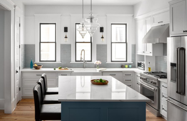
The back of the range is actually the back of the original staircase. That wall was the only existing wall, besides the exterior wall. There is a walk-in pantry back on the left wall, and which is separate from an adjoining pantry that is for their broom closet. It's very expansive, even though it feels very open and airy.
We were able to maximize and try to elevate the eye by adding in the sconces and the higher windows because these are 10-foot ceilings, which are amazing to find in such a historic home.
The island is painted a light blue just to accent the brick tile that they loved, and they brought the brick backsplash in because it again lent itself to the historic nature of the house. Often, you'll see some type of subway or and or brick uses the backsplash in a historic home such as this.
Everything else was pretty standard that you would find in a modern contemporary kitchen. The cabinets open for a little additional storage, and there is a 36-inch flat end range. They have a French store refrigerator as well as a farmhouse-style sink.
All of the finishes were kept classic chrome to lend itself to the historic nature of the house. The overall effect lent itself to be exactly what the homeowners wanted, which was light bright, and airy, but also bringing in eclectic colors, that, even though it's a soft palette, it feels very fresh and very new.
9. Craftsman Bungalow - Kitchen Remodel in Midtown
The number nine kitchen on our list is a 1920s home in Midtown Atlanta. We painted the cabinets a nice gray color, installed a marble countertop, and installed several floating shelves. This allows the kitchen to have a nice open feel without wall cabinetry, and it makes the area feel a lot more open.
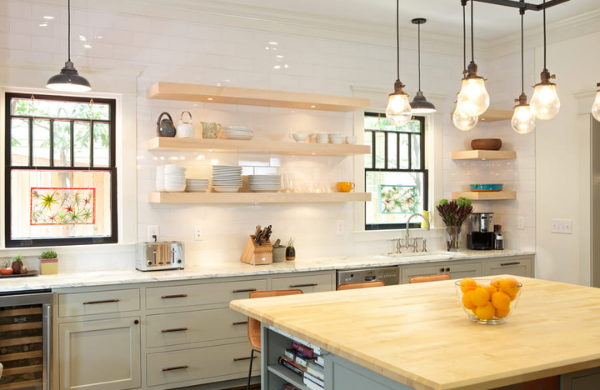
We also installed a new wood countertop on the island, which is a maple butcher block top, and we painted the window sashes black so they pop a little bit and add a little depth and color to the room.
We also purchased a new Viking range. You can see that it's orange, so there's a lot of color to it, and it provides a lot of pop to the room. We installed a new backsplash, which has a lot of dimension to it. If you could touch it, you would see that there's a lot of texture to it, and it really jumps out as well.
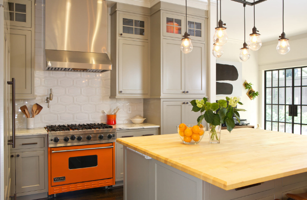
There is a steel door that's off of the kitchen that exits to the backyard, which is really popular right now, and very nice. The black contrast against the white walls helps to pull everything together.
8. Suburban Traditional - Kitchen Remodel in Dunwoody
The number eight kitchen on our list is a kitchen from a home in Dunwoody that we renovated.
As part of the renovation, we opened up the kitchen to the rest of the home by eliminating a wall between the kitchen and the dining room. We also added two windows on both sides of the stove hood. By doing this, it really brought in a lot of light.
For the most part, the kitchen is white, which also provides a nice open airy feel. We have a cabinet-grade stove hood that was also white. The wood stools add an element of warmth to the white and it looks really nice.
The island is a light gray color, and we have three overhead light pendants above the island that really added a nice statement with the size of the lighting.
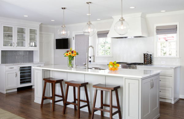
We also added a stainless apron hood. Typically, apron hoods are more traditional, but the stainless adds a nice modern element to it.
Taking the wall out really opened up this kitchen to the dining room and the rest of the home.
The bar area's statement piece is a metallic Chevron backsplash tile. Instead of it just being white, we added a metallic element as an element of interest, and it really provided a neat look to this kitchen.
7. Ranch Home - Kitchen Remodel in Buckhead
The number seven kitchen on our list is a kitchen we renovated in the Collier Hills, Buckhead area.
We opened up the kitchen to the rest of this ranch home. There was a wall that separated the kitchen from the rest of the house, and we eliminated that wall to create a nice open floor plan.
We added white cabinetry and white backsplash, so it gives the kitchen a nice open airy feel. The kitchen cabinets are inset shaker style, and the countertop is marble. The centerpiece of this kitchen is the green island and the brass lighting fixtures overhead. This really adds a nice pop of color to the white kitchen and brings an element of interest to it, and the brass goes well with the green as well.
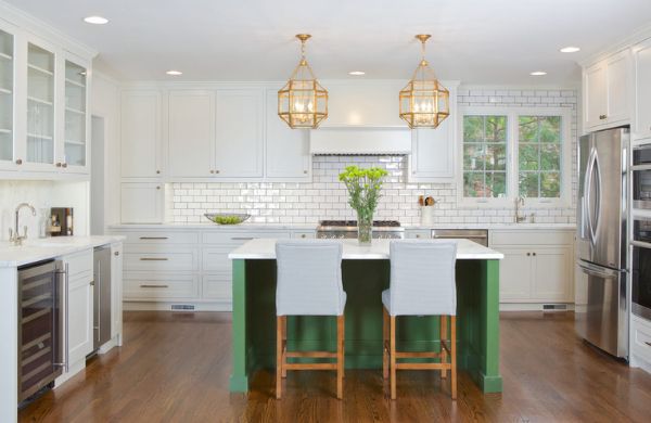
At the bar area, we used marble for the countertop and for the backsplash. If you look closely, you can see the veining and the marble continuous from the countertop up through the backsplash, as we used the same slab for both pieces. We think this kitchen turned out really well.
6. Kitchen Remodel in Midtown
The number six kitchen on our list is a kitchen we renovated in Midtown. When we encountered this kitchen, we found lots of rotted framing in this home. When we did the demo, the old kitchen, we had to do lots of structural work in this kitchen to make it work.
The main goal of this kitchen was we wanted to open it up to the living room. It is an open kitchen to the rest of the home with an open floor plan feel. We also wanted to lighten it up with white large format subway tile, and light gray cabinets. The light area really makes the blue island pop, which is a great blue color for the kitchen.
There is also an original brick chimney that was in the kitchen; this was a pleasant surprise! This chimney was behind the wall, and when we did the demo for the kitchen, we discovered it. The brick chimney was not in the original kitchen design, but once we found it during construction, we incorporated it into the kitchen design.
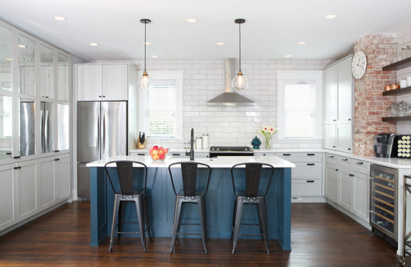
We had the bar shelves that terminate into the brick chimney, and it really adds a nice accent piece, so you can see a little bit of the older home element in the new kitchen.
We face the Florida ceiling cabinets in an antique mirror. So instead of doing just a regular painted cabinet door, we decided to face it with a mirror. It really gives the perception that the kitchen is a little bit bigger than it is with the images reflecting off of the mirror, and it just gives it a little bit of a bigger feel in the kitchen.
We also added a beverage bridge because the client was really into craft beer, so we have a dedicated area where he could store his craft beers in the under cabinet refrigerator, which really looks nice next to the brick chimney.
5. Tudor Home - Kitchen Remodel in Morningside
The number five kitchen on our list is a kitchen we renovated at a 1930s home in Morningside.
The goal of this kitchen was to open it up to the rest of the house. Before, it was a little bit siloed in that there were walls in-between the dining room and kitchen. We removed those walls, and now the dining room and kitchen are nice and open with each other.
There was also a door to the right of the refrigerator, and we enclosed that to allow us to get some more cabinet space in the kitchen, which worked out well. You'll notice it's a nice light airy kitchen, and the cabinets are a rose-colored quarter-sawn oak. The backsplash is a marble, which is nice and light, and the countertop is nice and light really provides a nice open airy feel to the house.
We added a steel window behind the sink and a brass light above, and it added a little touch of modern to the kitchen.
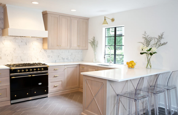
They also have a lacanche stove as the centerpiece of the kitchen, which is a very high-end French stove that the client wanted. The contrast between the dark black and the lightness of the kitchen really stands out. Above the stove is a stucco hood, which we painted white. The hood blends into the wall and blends into the backsplash, allowing the range to stand out.
4. Craftsman-style Home - Kitchen Remodel in Edgewood
The number four kitchen on our list is a kitchen we renovated a Craftsman-style home in Edgewood, Kirkwood area of Atlanta.
The client really wanted color. They use a lot of color in their home, which is very unique. A lot of people really want grays, neutrals, and white, so this was a really fun project to collaborate with them on.
We kept within the existing footprint of the kitchen, which was already a galley kitchen, and it was a pretty simple layout. We kept the sink where it was, we kept the range where it was, we kind of moved a couple of things around, but we really gutted it and did all new cabinets, and replaced the doors in the back. It was an old builder-grade door with a transom over it, and we replaced them with eight-foot doors, which created a really great dramatic focal point in the kitchen.
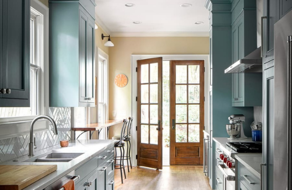
The Sherman Williams color that we used on the cabinets is underseas, and we did a little breakfast bar. We just ran it right across in front of the windows.
We did some new sconces, and all the fixtures and finishes are new. Towards the end of the kitchen, we did a little bar with a wine fridge below and some shelving. We did a walnut wine and cocktail glass storage with glass, and there's a lot of really special features inside the cabinets.
We did big drawers for all their pots and pans, and they have really high ceilings in this house. It was nice to take advantage of taking the cabinets all the way to the ceiling, which makes it feel so comfortable. Galley kitchens are often the best kitchens to cook in. They're the most functional and work really well for chefs. The owners are really into cooking, so this kitchen is perfect for them.
3. Mid-Century Modern - Kitchen Remodel in Buckhead
The number three kitchen on our list is a Mid-Century Modern project that we did in Buckhead.
The house was very mid-century, and the client was really passionate about mid-century modern architecture, design, furnishes, and he really wanted to keep the kitchen and the renovation in that historic mid-century feel.
We went with oak cabinets, and the kitchen that we removed when we did the renovation was the original 1950s kitchen, which was really unique. You don't often see cabinets last that long and look that good. They really held up well, which is a testament to the architecture and design of that era. We went back with a red oak with heavy grain, not something you see very often these days, but we think it just went perfectly in this kitchen.
We also added a focal wall. We did a really interesting backslash with a lot of texture, depth, and color variation. We did white quartz countertops, and we've got a built-in refrigerator and microwave, and a convection oven.
We did a custom hoods surround, but we didn't do any shelving or cabinetry on the wall, other than the hood. We wanted to keep it light.
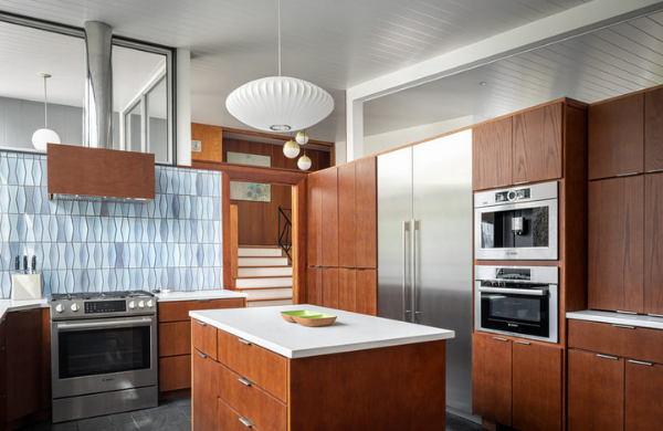
We also added a Nelson pendant. A lot of his lighting is super mid-century so we just kept with that style. We really wanted to go back with something similar to what would have been there in the 50s.
We painted the ceiling white, and we wrapped some of the ceiling beams white, keeping it light and bright. A lot of kitchens in the 1950s had cabinets coming down from the ceiling to close in the space. This kitchen did have those originally, and we wanted to sort of nod to that, so we added floating shelves, which gives that feel of what the original kitchen might have had while keeping it light and bright. The owners are big pottery collectors, so this is a nice place for them to display their pottery.
We also installed a huge sink: 48 inches. They really wanted a lot of the modern amenities of the new kitchen in this house to feel really original. We also replaced all the windows, which was a big part of the project, because the windows were also really large.
We did some new paneling around in the space, and the dining room with the owner's vintage furniture just blends in perfectly. We were really careful about how we were demoing the cabinets and how we went back and blended the old with the new, and we think it worked really well. It fits right in with the new cabinets, and it is a nice little feature to have original to the house.
2. Ranch Home - Kitchen Remodel in Sherwood Forest
The number two kitchen on our list is a 1950s ranch kitchen remodel!
We started by taking a bunch of walls down, opened the kitchen up to the living room and the dining room to give them a much more open floor plan, and made the kitchen larger.
The house is in Sherwood Forest, which is in the Midtown Ansley area, and the client is an architect that really values materials in their natural element, so we tried to keep things really organic. The wood is maple cabinets and walnut cabinets. The wood on the Island peninsula was actually reclaimed wood from the vaulted ceiling that we raised. We raised the vaulted ceiling, took these pine original framing members out, and we reclaimed them into this island and it really gave it this cool, rustic, interesting feel.
There is a porcelain backslash, kind of giving it a stone look. They wanted a bit of open space and open storage space and closed storage space. One cool thing to point out is the wood grain across the front of the cabinets all matches. So it's one big piece of maple seamed together with the different cabinet doors and drawer fronts.
We did no hardware, just keeping it really simple and modern. They wanted two sinks, two dishwashers, and a lot of really cool appliances.
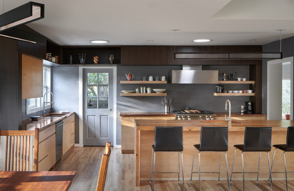
With the lighting, we kept it really modern. There's a lot of natural light in the house. It was originally a bit dark. We laced the countertop, and it creates a waterfall edge along the side.
We wrapped the backslash around the corner of the Florida ceiling, giving it a really simple, streamlined, modern look. The island turns into the bar, which is open to the family room.
You might have noticed that you haven't seen a refrigerator. The refrigerator is actually in the Butler's pantry mudroom off the kitchen, which they really felt passionate about. They wanted to have that, and more pantry space in there. So there is no refrigerator in the main part of the kitchen, which is pretty unique. It turned out great, and it's just a fun modern project.
1. Historic Colonial - Kitchen Remodel in Poncey-Highland
The number one kitchen on our list is a kitchen remodel we did in Inman Park! It's an over 100-year-old home, colonial style. We did a full home renovation and a two-story rear addition on this one.
It had really never been renovated before, so we did a lot of work on it, and we touched every space. The clients really loved contrast and color with the fun red color on the exterior with some brick accents.
On the interior, the kitchen, we did a green color, and we spent a lot of time selecting and going through a lot of different greens before landing on this one. We also accented the space in a lot of different rooms with black and brass tones.
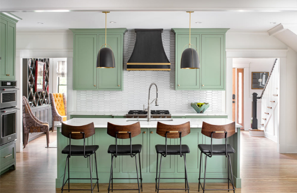
We did brass straps with brass rivets and spent a lot of time designing that with the custom hood maker, and I think it's a really nice focal point in the space, and the pendants frame it really nicely. The green is a really fun color.
On the island, we did a really interesting edge and custom inset cabinets with quartz countertops. We also accented those black and brass tones in the fireplace, which is part of the addition, the family room.
We did some wood accents in the bar area. The inside of the cabinet is stained oak wood, and we did a custom line refrigerator. It was a really fun project, and we think the clients were really happy with it.
Thank you for watching our videos! We hope you enjoyed learning more about some of our favorite kitchen remodels in the Atlanta area. If you would like to discuss your home remodeling goals, fill out our contact form or give us a call at 404-418-1342.


